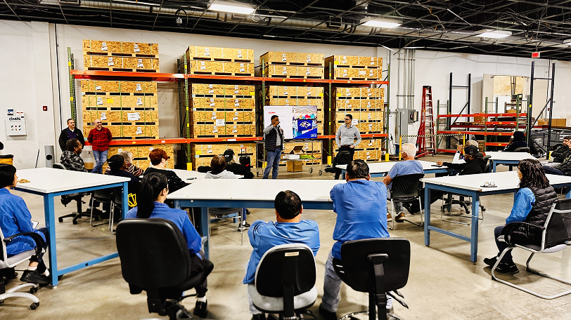
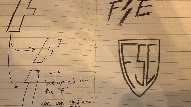
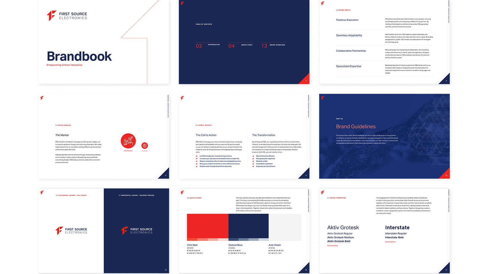
Leading global companies rely on First Source Electronics for their warehouse and industrial automation solutions. Fortress stepped in to kickstart a new era for FSE under its new ownership, leveraging our proprietary Brandstorm exercise as the foundation for the rebrand. FSE is now built to thrive in the company’s private equity-backed present and future highlighting their Made In America approach to manufacturing.
FSE’s brand needed a complete departure from the stale, corporate look influenced by their prior ownership by a publicly traded company. We wanted the look and feel to match the future-first vision of the company, showing their customers that FSE is the partner they need that’s focused on building American made products.
Fortress conducted our proprietary Brandstorm experience to uncover several of FSE’s core narratives and translated those insights into a powerful new brand. From the conceptual spark of the new logo to the intentional red, white, and blue color palette, our strategic rebrand demonstrated that a logo is just the tip of the iceberg: true transformation lives in story, consistency, and execution.


Our Brandstorm workshops are immersive, collaborative sessions where we help clients unearth their brand’s DNA. With FSE, we engaged stakeholders across leadership, engineering, and operations, revealing a cohesive narrative around American-made quality, agile problem-solving, and relentless innovation. The result was a customized roadmap that is set to inform every creative decision, ensuring alignment between FSE’s mission and its visual identity.
More on what a Brandstorm is can be found here.

We moved away from FSE’s outdated wordmark to a dynamic, multi-dimensional logo. The new symbol fuses the numeral “1” (first-to-market leadership) and a stylized “f” in a bold, angular bolt—conveying energy, forward momentum, and precision engineering. This logo isn’t a mere graphic; it’s the visual embodiment of FSE’s promise to electrify manufacturing challenges into opportunities while drawing inspiration from tech and software companies.
The chosen color palette embodies strength and confidence with a distinctly American spirit. The deep, commanding blue provides a trustworthy foundation, while the bright, dynamic red adds a spark of energy and action. White keeps the design crisp and uncluttered, allowing ample white space for a clean, minimal aesthetic. Together, these colors reflect the precision and reliability of First Source Electronics’ products, and the commitment to American manufacturing that the company champions.
Huge shoutout to Fortress Consulting Group for their incredible work in bringing our vision to life!
